Case study · Likewise Choice Awards
Role
Lead Product Designer
Scope
Product, UX/UI, visual identity, GTM
Platforms
Responsive web, mobile app entry
Timeline
Summer 2025, ~3 months
Status
Concluded, ~6,600 unique voters

The Choice Awards landing page: campaign identity, voting entry points, and last year’s winners.
The opportunity
Likewise already had an audience built around discovering and recommending entertainment. Choice Awards started as a simple year-end recognition idea. The opportunity was to grow it into something Likewise could own as a recognizable annual moment: a voting experience that increased engagement, gave partners something to promote, and reinforced Likewise as a taste-making, data-informed entertainment brand.
My role
I owned product strategy, information architecture, voting mechanics, UX/UI, and the campaign’s visual identity end to end, then carried a significant share of the go-to-market execution across email, social, and promotional surfaces. I worked alongside product, engineering, marketing, and editorial to ship it.
From recognition to participation
A year-end recap can be passive. An awards experience can’t. The core shift was structural: instead of publishing a list of winners, Likewise would let its audience decide the winners across four categories (Movies, TV, Books, and Podcasts), each with roughly 25 nominees, and let people cast up to five votes per category, spent however they wanted.
That single change turned Choice Awards from content into a system: nominee data, voting states, per-category navigation, a closed-voting interim state, and a results reveal all had to work together, and work again next year.

Movies, TV, Books, and Podcasts as four parallel voting categories, one campaign identity.
What the experience covered
Category voting
~25 nominees per category, up to five favorites, spent across as few or as many titles as someone wanted.
Confirmation & results states
Vote confirmation, a closed-voting interim state, and a final winners reveal per category.
Lightweight app entry
With engineering resources tight, the mobile app pointed into the responsive web experience rather than duplicating it natively.
Campaign & GTM assets
Identity, badges, and promotional creative built to extend across email, social, and product surfaces.
Designing the voting system
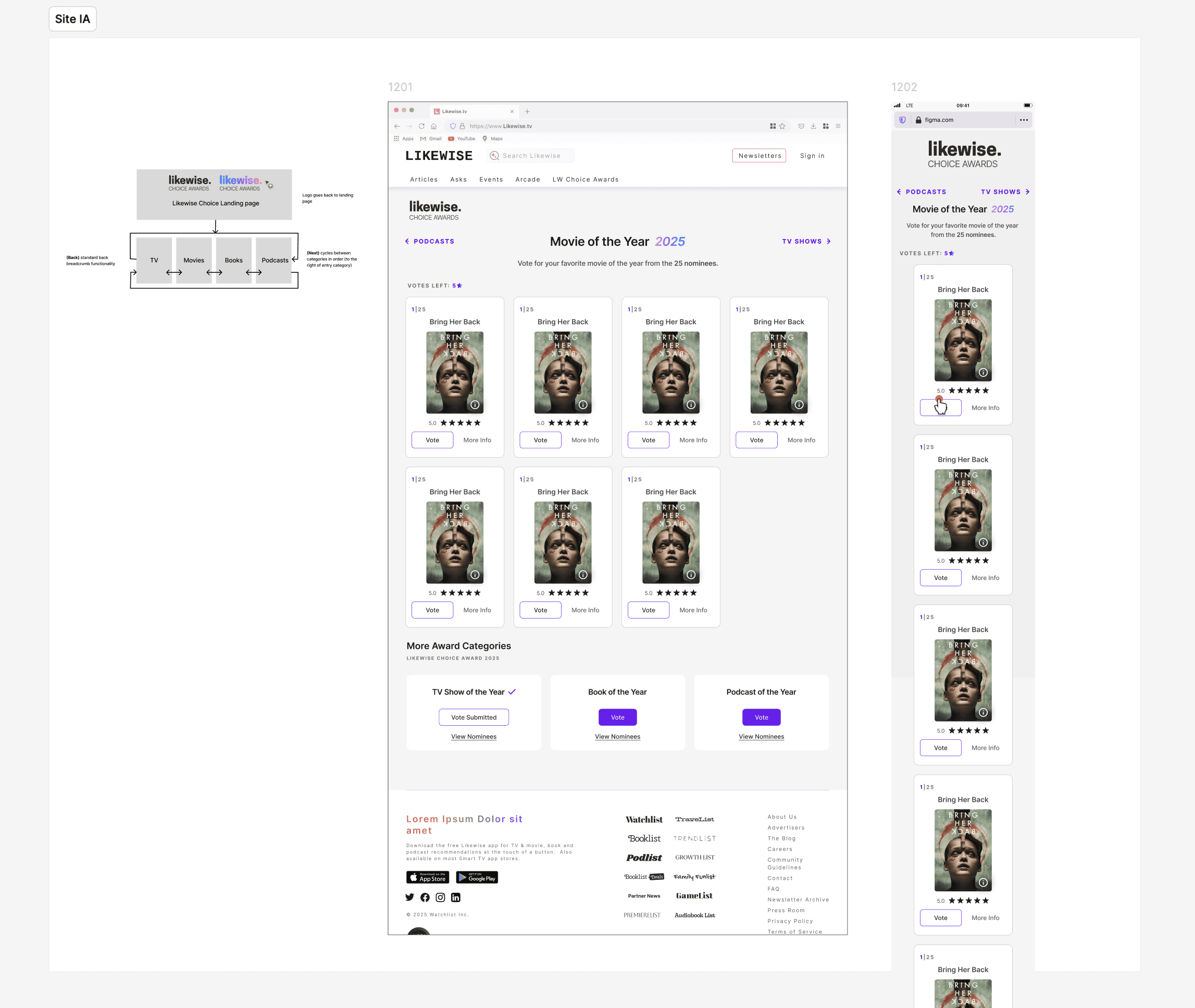
I explored several structures before landing on the flow below. A few of the decisions it produced:


1
Five votes, spent however you want
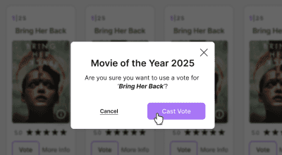
Rather than one vote per category, each visitor gets five to spend across the ~25 nominees, all on one favorite or spread around. Five votes created more room for expression than a single winner-take-all choice, while keeping participation constrained enough for each vote to feel consequential. A confirmation modal on every vote prevents accidental taps from burning a limited resource.
2
One flow, four categories, several entry points
Email, homepage, social, and item detail pages all needed to land people in the same voting flow without feeling like separate products. Registering or logging in unlocked additional votes, giving the flow a second, optional loop rather than a hard gate.

3
Designing the gap between voting and results
Voting doesn’t end the moment results are ready. The interim closed-voting state kept the same category navigation and nominee grid, but replaced the vote action with a clear date for winners, which kept the experience alive instead of dead-ending at “thanks.”
Building an awards identity
I built the visual language as a system: a star/trophy mark, a gradient wordmark, and dark, entertainment-forward artwork designed to scale across four categories, nominees, winners, and every promotional surface.


The wordmark took on category-specific gradients while staying recognizably one mark.

Winner badges, in light and dark, sized for email, social, and on-site placement across all four categories.
Taking it beyond the voting page
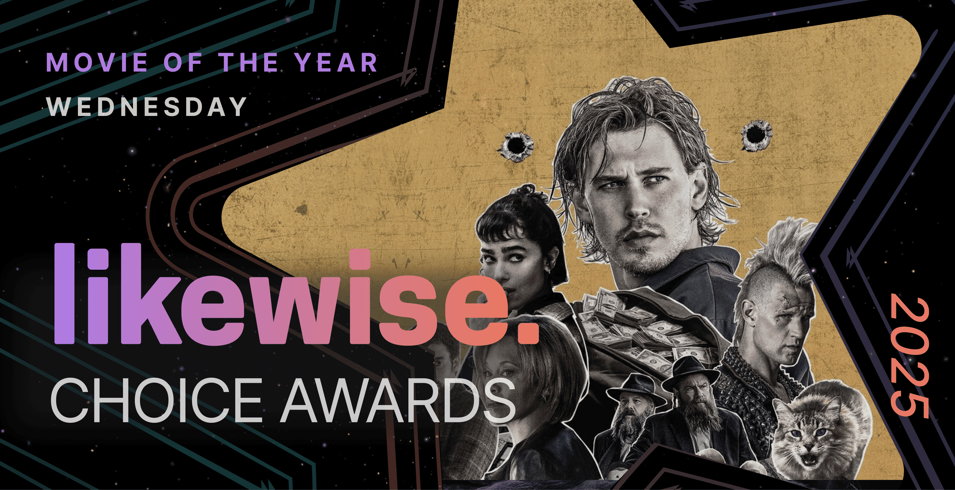
One title’s key art, dropped into a reusable template, scaled into every format the campaign needed. No redesign per nominee, per category, or per surface.



Meeting people where they already were
Inside the Likewise app, the same identity showed up as a takeover moment and as an in-feed placement. Both pointed straight into the responsive voting flow rather than a separate native experience.

The same system extended to standard IAB ad sizes, from a 970×250 leaderboard down to a 320×100 mobile banner.
Launch, results, and what we learned
unique voters in the first expanded Choice Awards, each able to cast up to five votes per category.
A marketing analyst ran a postmortem after launch. A few findings from that analysis, alongside what shipped:
•
The voting and awards experience launched successfully across all four categories, establishing a foundation that could expand in future years.
•
Newsletter banner placements outperformed standalone rolling-send messaging as a way to drive votes.
•
Editors and publicists in the Books category responded well, using the nomination and winner recognition as promotional material.
•
The concept showed potential as a recurring annual franchise.
Opportunities identified for next time
The postmortem also surfaced areas to strengthen in a future iteration: deeper voting analytics, voting-integrity safeguards, multi-round voting, more urgency in the campaign window, a more permanent and SEO-friendly destination, expanded categories, and stronger activation for client and partner accounts.
Reflection
This project was less about any one screen and more about carrying one idea through product, visual identity, and go-to-market as a single connected system: entertainment enthusiasts vote on the year’s best. Constrained engineering resources meant the mobile app stayed a lightweight entry point into web rather than a full native build; that tradeoff kept the team focused on getting one voting experience right instead of maintaining two. The visual system did double duty as both the on-site UI and the campaign’s promotional face, which meant every decision about the star mark, gradients, and badge templates had to hold up in a browser and in a newsletter alike.
It reinforced for me that the strongest brand moments aren’t layered onto a product after the fact. They’re designed into the mechanics of the experience itself.