Case study · Likewise Plus
Role
Sr. Product Designer
Scope
0→1 subscription, paywall strategy
Platforms
iOS, Android
Timeline
~6 weeks
Status
Live, ~350 subscribers
The opportunity
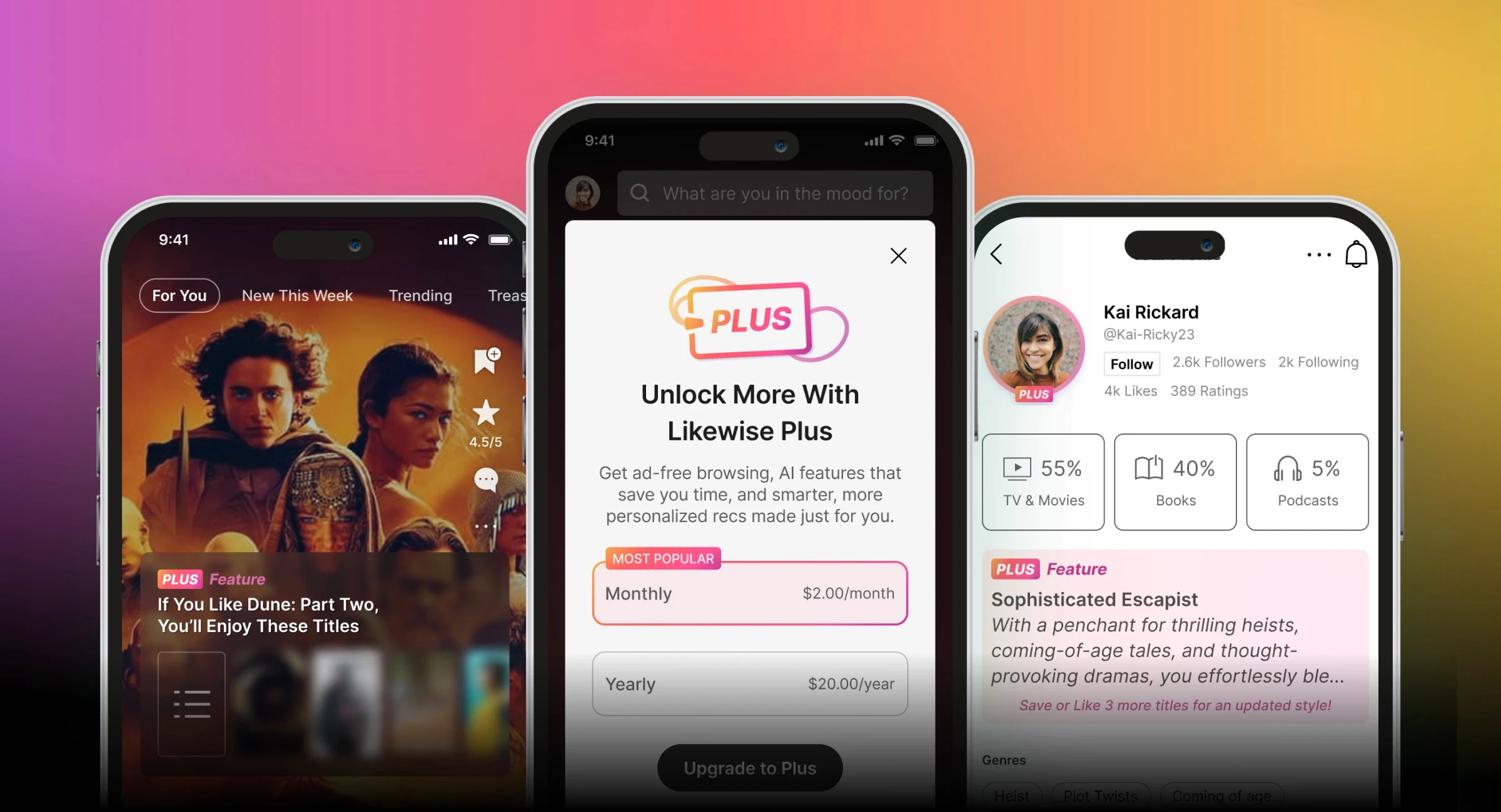
Likewise had operated as a free, ad-supported product since launch. To build a sustainable, direct-to-consumer revenue stream, the company needed its first paid subscription tier, without undermining the free discovery experience users already relied on.
Context
With paid acquisition already paused, Plus launched into a primarily organic, word-of-mouth growth environment, putting more pressure on the product itself to communicate clear value.
What Plus offered
Plus centered on a focused set of premium, AI-powered experiences designed to make discovery more personal and useful, rather than a long list of gated features.
Entertainment personality
An AI-generated profile built from a user’s ratings and saves, designed to sharpen recommendations while making their taste feel tangible and shareable.
Instant AI responses to Asks
Faster, more tailored answers to open-ended recommendation requests.
AI-summarized community reviews
Condensed hundreds of reviews into a quick read.
Ad-free browsing & exclusive newsletter
The baseline value layer beneath the AI features.
Key decisions
Finding where premium belonged
Likewise had never gated a feature before. I mapped the full product with product and engineering to determine where a premium boundary would add real value instead of feeling like a tax on the experience people already used for free.
Protecting the free experience
Every paywall entry point (profile, watchlist, recommendations, ask) was designed to introduce Plus at moments of natural interest, so the free product stayed genuinely useful rather than feeling artificially restricted.
Making the tier distinction feel intentional
Tier registration, upgrade flows, and confirmation moments were designed as an invitation into a clearer, more personal product, not a wall blocking access to what people already had.
Building it cross-functionally
As the sole product designer, I worked in lockstep with the head of product and iOS, Android, and web engineering to define the subscription model and keep it consistent across platforms as it took shape.
Design in practice
The subscription experience took shape through iterative rounds with product and engineering. A few of the decisions it produced:

1
Contextual paywall triggers
Rather than a single generic upsell, the paywall appears in context, triggered when someone reaches a gated moment (entertainment personality, review summaries, an Ask) so the pitch is tied to something they were already trying to do.


2
Making the AI value tangible
The entertainment personality feature turns a user’s existing ratings and saves into a concrete, shareable result, and the AI-summarized review on the item detail page delivers the same payoff at the point of decision. Together they give the abstract promise of “smarter recommendations” a specific, personal payoff.
3
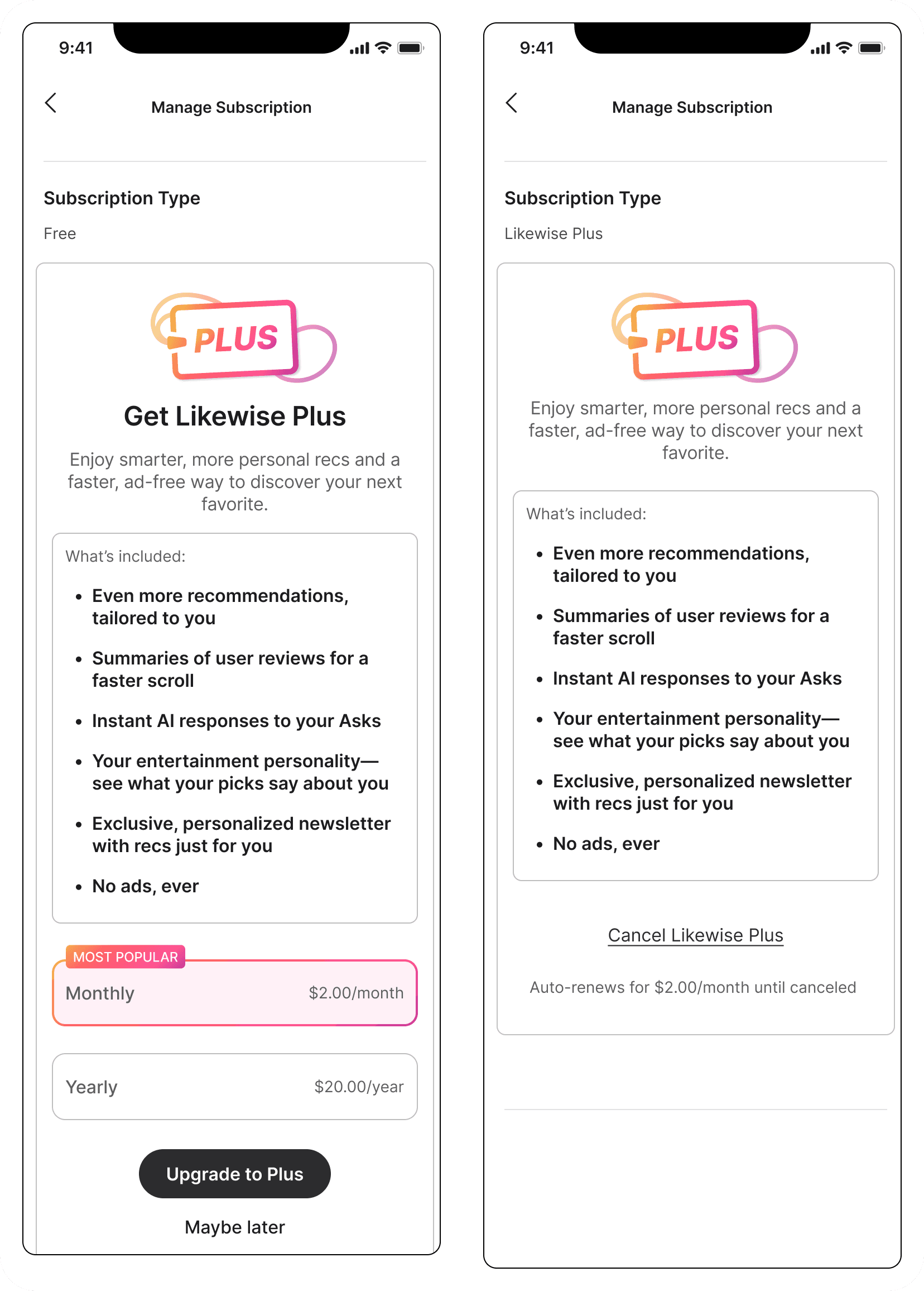
One screen, two states
Free and paid states share a single subscription-management pattern. Free shows the paywall card in place, Plus shows plan and renewal details, so managing or upgrading never required learning a different piece of UI.
4
Closing the loop on purchase
A short welcome tutorial follows checkout, connecting the payment a subscriber just made to what they actually unlocked, reinforcing the value before they’ve had a chance to use it.

5
Mapping the system, not just the screens
Registration, entry points, and subscription management were worked through together as a connected system with product and engineering, so edge cases (cancellation, re-subscription, tier changes) were accounted for before they became support tickets.

Outcomes
•
Shipped Likewise’s first paid subscription experience across iOS and Android
•
Established a premium UX framework used as the template for future paid features
•
Maintained ~350 paying subscribers in an organic, word-of-mouth growth environment
•
Delivered concept-to-launch in ~6 weeks as sole designer across both platforms
Reflection
Deciding where premium belonged was harder than any individual screen: Likewise had never charged for anything, so there was no precedent for where a paywall should sit. That meant working through the tier registration and paywall logic end to end alongside product and engineering, and revising it as real edge cases surfaced. The six-week timeline also forced a real trade-off: we could ship Plus across iOS and Android, but adding web would have required a separate Stripe integration we hadn’t scoped. Rather than delay mobile or rush a third platform, we muted Plus functionality on web and planned to validate the model on mobile before expanding it.
Working solo across iOS and Android forced real discipline about what stayed consistent versus what could flex per platform. Launching in six weeks, with no paid growth safety net behind it, meant the design had to work on its own merits from day one.